 See all projects
Rénovation et transformation des espaces de l’exposition « The Family of Man »
NJOY architectes d'intérieur muséographes éclairagistes
Category
Architecture d'intérieur
Placement
Nominee
LAA Edition
2015
Author(s)
NJOY architectes d'intérieur muséographes éclairagisteswith
Maria Luisa Guerrieri Gonzaga (architectural lighting)Client
Ministère de la Culture (Service des Sites et Monuments Nationaux) et l'Administration des Bâtiments Publics
Year of completion
2013
Location (city)
Clervaux
Description
Two heritages had to be handled at the same time: a historic architectural substance to be restored and adapted to new standards of conservation and energy concepts, transformed to enhance the photographic heritage. And, on the other side, an iconic photographic patrimony that had to enhance the historic exhibition space.
Before dealing with the exhibition itself, our general approach was practical and technical: reorganize and centralize the reception facilities for the visitors, upgrade the remaining historical building substance and create a better environment for the conservation of the historic photo collection.
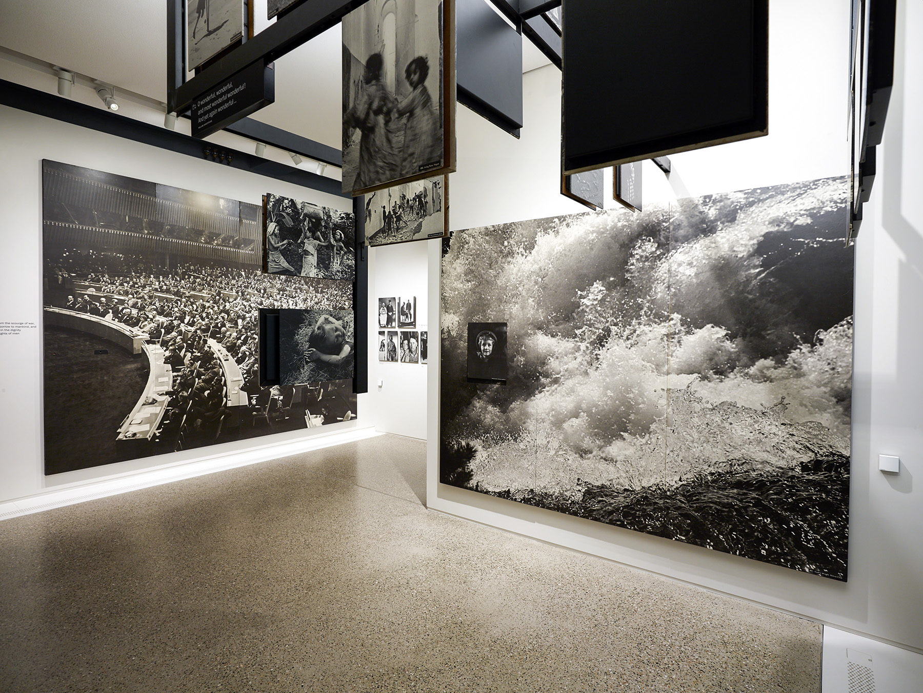
The new exhibition layout plays, like the original display at the MoMA, with spatial sensations. The photographs of the Family of Man exhibition were initially chosen according to their capacity of communication, while the layout allowed visitors to immerse themselves in a photographic essay.
To exhibit this heritage today calls for a deference to history and an almost archaeological approach: the course of the exhibition and the chronology of the images have been respected and follow the layout of the original exhibition at MoMA in order to recreate the visitor experience and the effect the images have on them.
This approach nevertheless demanded a shift away from history, resulting in the exhibition rooms to feature a very sober architecture. To keep the original flow and interaction between the themes and their images throughout the exhibition, we had to create some openings in the existing structure.
The new vertical connection between the two floors of the castle wing has been achieved by a succession of split-levels installed in an until now undeveloped attic space. This makes the visitor progression fluid and natural, even though our floor plan made of adjoining rooms is far away from the square shaped layout of the original MoMA exhibition set.
The sequences of the different themes through the exhibition and their rooms, the transition from one level to another, the integration of new spaces like a documentary library, gives the exhibition a further momentum punctuated by pauses, without distorting it.
Smooth immaculate exhibition screens, in a compact surface material, define spaces detached from the historic building envelope. Their restrained design brings forward the ‘dynamic flight’ of the pictures.
The encounter with the medieval substance of the building occurs in slightly hidden spaces behind the exhibition screens: the historic profound window niches have been transformed into seating areas, which invite visitors to rest or to collect information on their electronic guiding system. They also offer vistas to the outside surroundings.